
the road to impervious
cover one
The masters students at UCLan were lucky enough to have a chance to put forth their design ideas for the upcoming release Impervious, a novel procured the UK rights to. The story follows Trina, just a regular high school girl whose life changes in the course of a second.
From the Synopsis:
Trina Warren didn’t plan on being anyone’s hero. She planned on going to fourth period as normal. But then there was a bang, and an overturned chair, and everything was different. Now Trina finds herself in a fantasy world, pursued by a faceless, nameless monster that only she can stop. Just one second is all it takes for Trina to turn from a regular clumsy high school girl, to a monster-fighting warrior. Just one second is all it takes for everything to change . . .
Previous to this opportunity, I sensitivity read Impervious for UCLan before we acquired the UK rights due to the content. Obsessed with the manuscript and ready to create some fun designs, I went straight to it! First, I started my research. Being American, this mainly revolved around books similar to the subject matter at hand that have already been published in the YA market in the states. I decided gathering inspiration from their trends while still spinning it to fit the very unique narrative of Impervious was important.
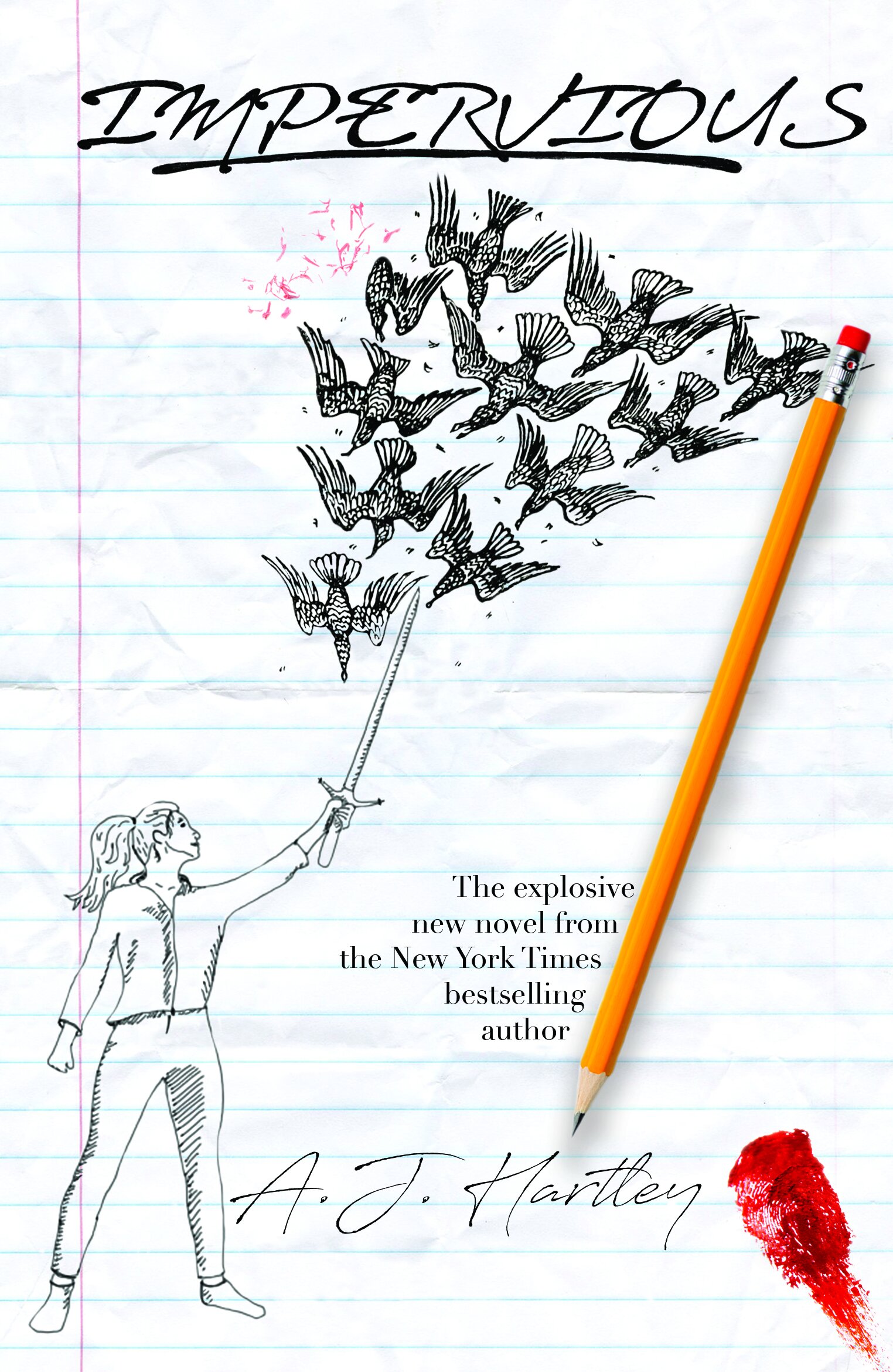
Many mistrials and “first-starts” with no finishes happened before I had my first epiphany. The confusion of reality versus fantasy in the novel heavily inspired me to create my first cover (left). I worked tirelessly on it, making sure it was just right.
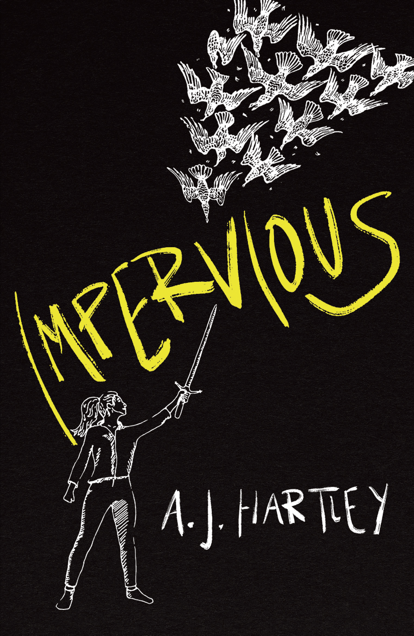
cover two
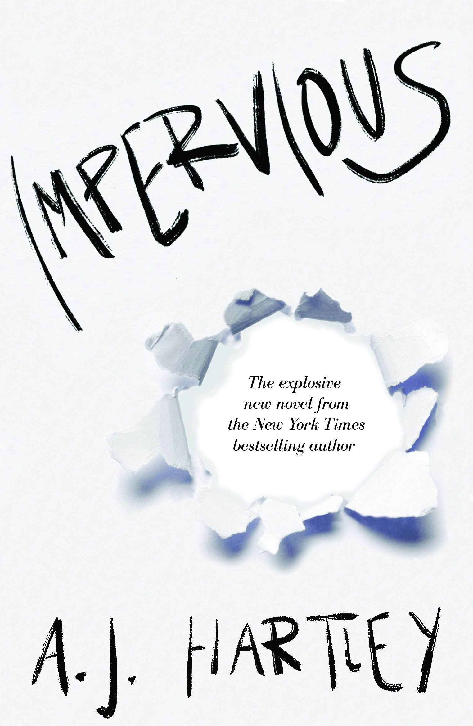
We had the opportunity to submit three separate cover ideas. So once I finished up with my first cover I was 100% submitting, I decided to go for something a little more simple and understated. I wanted the reader to understand the impact of this book, while still not understanding the exact content and letting that be a mystery to them. I created my own lettering for this one, which ended up being used for the final cover that is being published.
cover three
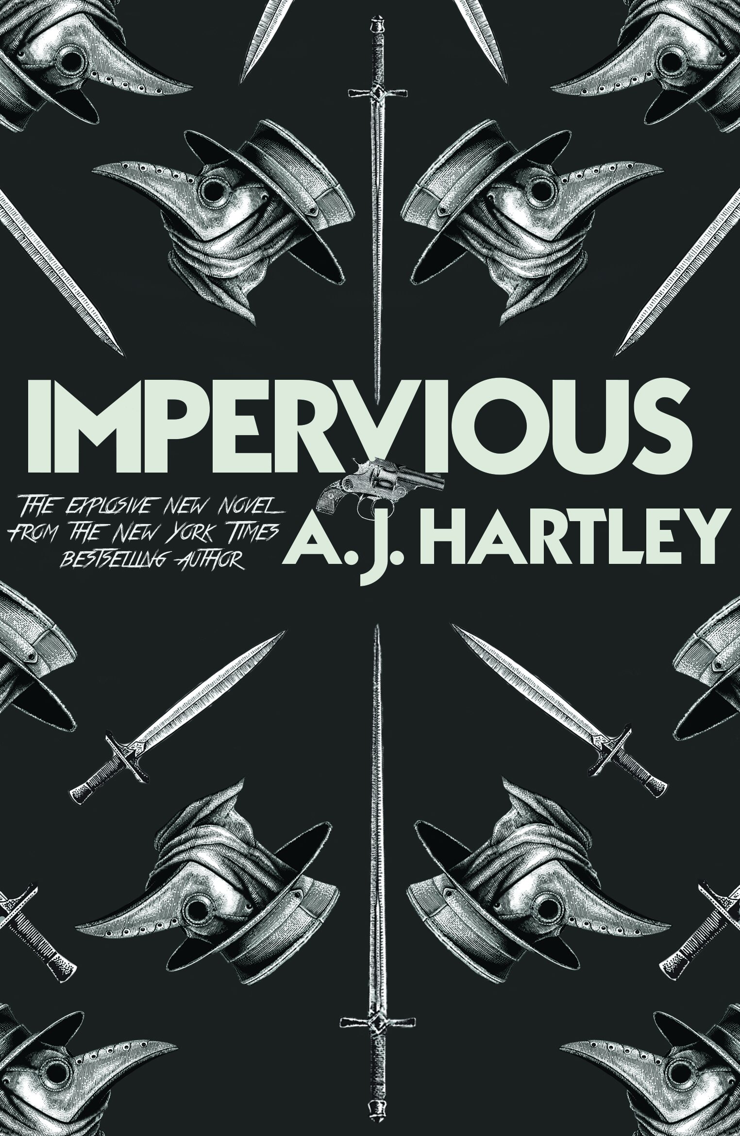
The final cover I submitted was aimed at a more adult audience. Taking inspiration from cloth-bound classics with a hint of the plot line intertwined, I formed the pattern to the left. The elements are all very bold and interactive, something I found important to the story.
merged cover
Once sent over, all who submitted waited for feedback and a final choice. Becky Chilcott, the Art Director, responded after I had reached out to check up on the process and shared with me a design she had pulled together using two of my ideas. She merged my lettering and the original idea I had. She also added some color to the title to make it pop.
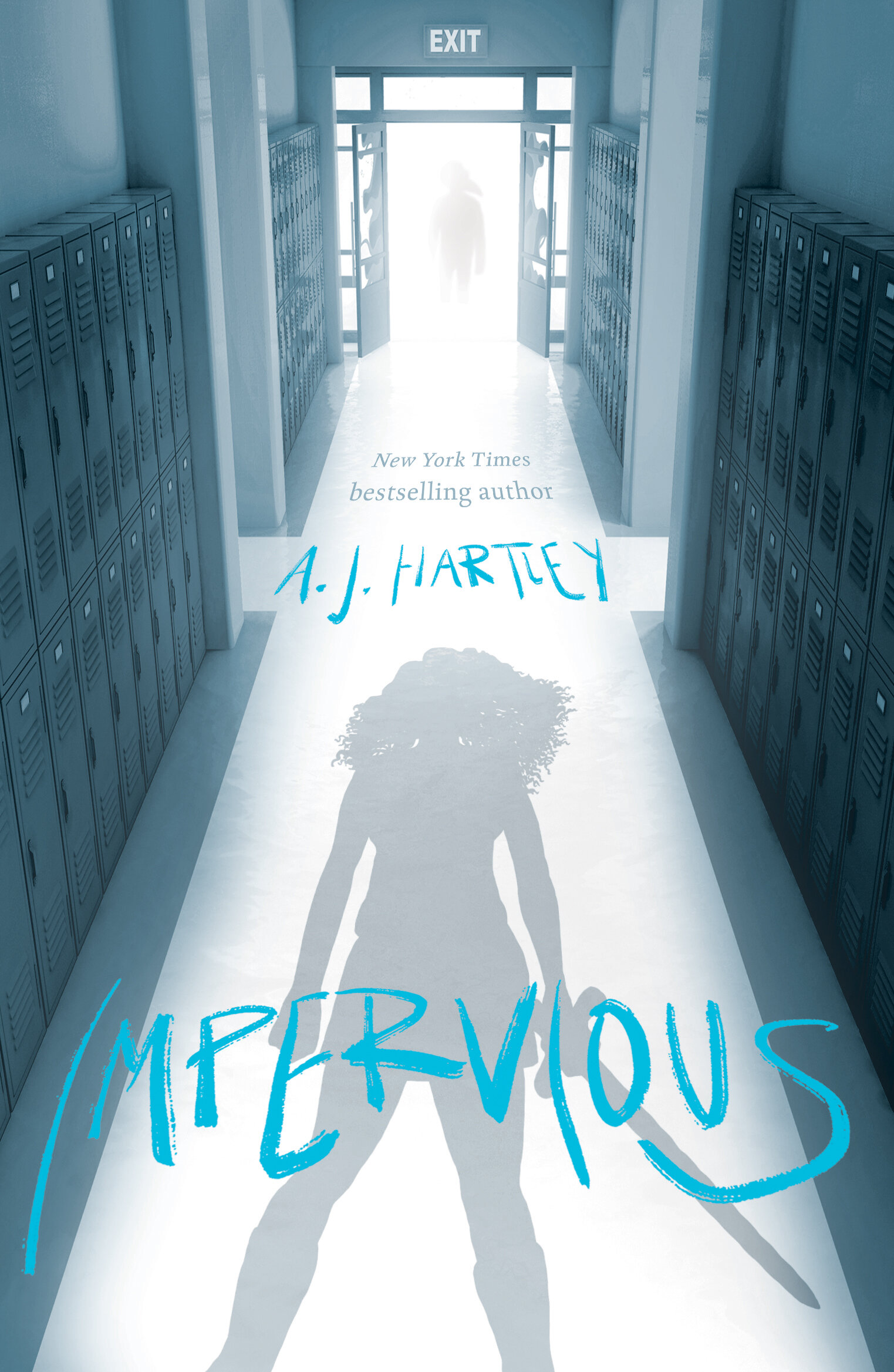
Lettering by Sunshine Tucker
Cover design by Emma Hennigan
Art direction by Becky Chilcott
Photographs © http://istock.com
Silhouette illustration © Jill Tytherleigh
final cover
Finally, we were all made aware of the final cover! This is the cover that will be published in July 2020. They combined my lettering with the concept of another peer (Emma Hennigan). Becky found the hallway image from istock and Jill Tytherleigh was commissioned for the silhouette illustration. The cover fits the UK Young Adult market perfectly and the blue color palette is beautiful, something that will allow Impervious to fit in amongst other YA books on the shelves while simultaneously standing out amongst the crowds.
Impervious is available for pre-order at Waterstones. To order, click here.